Lena Burdick

I am a data-driven professional who is interested in projects that combine mathematical analysis with creative design.
Here, I hope to highlight some of my projects.
View My LinkedIn Profile
View My Upwork Profile
Airtable
Project Description:
This project is a collection of data from four NBC TV shows: The Office, 30 Rock, Community, and Parks and Recreation. This data was initially collected using the methods outlined in Data Collections Methods.
Why Airtable?
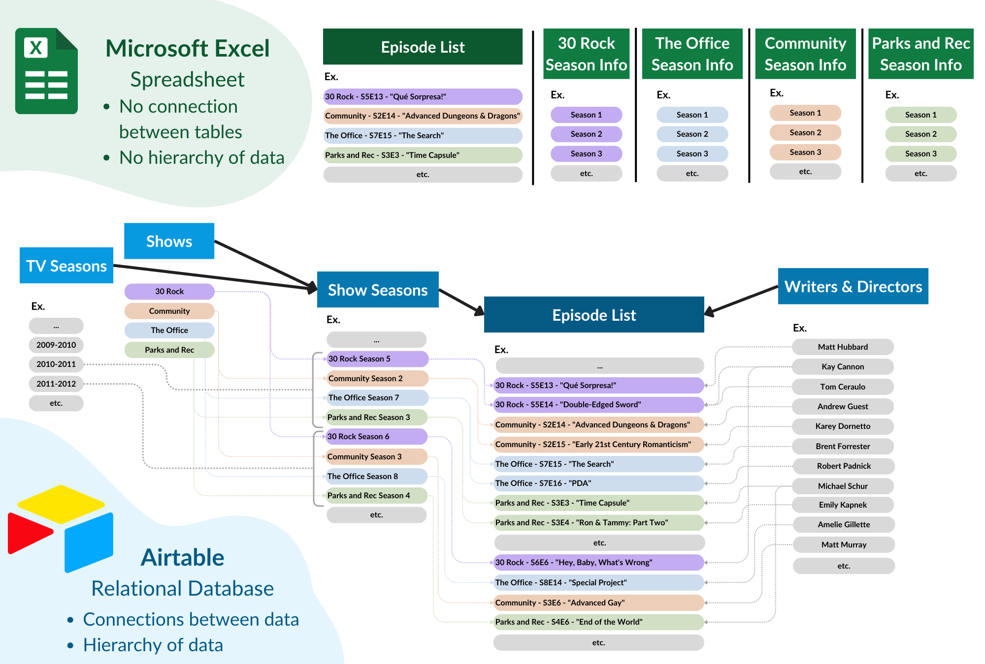
Airtable is a relational database software. This allows for more complex links between data than spreadsheet software like Excel or Google Sheets. Airtable also allows users to create interactive dashboards and views. Expand the section below to see the differences in the data structure between Airtable and Excel.
Full Page Screenshot
Access the Database:
Airtable is limited in public features that can be accessed without an account. I hope to expand the publically available features of this database, but in the meantime, you can get a sense of the base through the screenshots below or by watching the video (coming soon).
You can request access to a read-only version (account required) of the dashboards below. You can also publically access some of the pages below (no account required), but much of the data is restricted and will not render.
![]()
![]()
Explore the Dashboards
One of Airtable’s main strengths is the ability to create user-friendly interfaces. These allow users to interact with (and even update) data from custom pages tailored to their needs. Here are some sample pages from this interface.
Menu
Introduction to Base
Page Type: Dashboard
Featured Elements:
Buttons
Buttons allow users to navigate to other pages in the interface, open a record creation form, go to external URLs, or go to URLs associated with the data (such as an episode’s Wikipedia page).
Numbers
Numbers summarize data linked to a record by finding a sum, average, maximum, count, or other measure of that data.
Charts
This bar chart shows the average views-per-episode received by each TV show per season. The overlapping line graph shows the maximum number of views any individual episode received that season.
Gallery View
Gallery views summarize records through a primary image field (in this case, the show logo), with other selected data displayed below. To avoid having too many fields, I created a field called “Basic Info Summary” that summarizes the number of seasons and episodes in a given show. The cards in this gallery view show the fields “Basic Info Summary” and “IMDB Description”.
Formula for the field “Basic Info Summary”:
Name & " is a " & {Years} &
" sitcom that ran for " & {Total Seasons} & " seasons and produced " &
{Total Episodes} & " total episodes. It premiered on " & DATETIME_FORMAT({Premiere Date}, 'MMMM DD, YYYY')
& ", and its finale aired on " & DATETIME_FORMAT({Finale Date}, 'MMMM DD, YYYY') & "."
Shows Overview
Page Type: Record Review
Featured Elements:
Buttons
Buttons allow users to navigate to each show’s Wikipedia page, Peacock link, or JustWatch link (to see an updated list of streaming services where the show is available). After drilling down to deeper levels of data, users can visit the Wikipedia page for an individual episode, writer, or director (if available).
Click Into Record Details
By selecting a piece data on one page (ex. “Season 5” on the “30 Rock” page), users can see deeper levels of data. On this page, users can see stats and information for each show, season, and episode in the dataset. Users can also select individual writers or directors to see a list of all their writing and directing credits between the four shows. Each TV Cycle Year (ex. 2010-11) even has its own page with an overview of which of the 4 shows was on that year, their timeslots, and statistics about each of them.
In-Line Editing
Authorized users (me) can edit rating and review information from the page itself. This makes it easy to look up an episode and review it without needing to open the larger database.
Episode List
Page Type: List
Featured Elements:
Hierarchies of Data
This list utilizes two levels of data: TV Cycle Year and Episodes. Information about each TV year (like which shows are on air that year) can be displayed in the year header, and information about episodes can be displayed in the episode rows. Users can click into either years or episodes to see detail pages. Lists in Airtable can have even more levels, which can be useful for projects where hierarchies or dependencies are important.
Grouping, Filtering, Sorting, and Searching
Users can apply their own custom grouping, sorting, and filtering to the data. Users can also search for an episode directly by title. This makes this view the most useful for finding specific episodes quickly.
Lena’s Reviews
Page Type: Gallery
Featured Elements:
Gallery View
Gallery views summarize records through a primary image field (in this case, the DVD cover), with other selected data displayed below. This view is filtered so that it only shows episodes I have rated or reviewed. Users can click on an episode to open the details page, where they can see information and statistics about an episode or edit ratings/reviews in-line.
Season Timeline
Page Type: Timeline
Featured Elements:
Timelines
Timelines allow Airtable users to visualize events or periods of time using a start and end date. For more complex timelines– such as production schedules where one task may depend on the completion of another– Gantt Charts are also an option.
Calendar
Page Type: Calendar
Featured Elements:
Calendars
Calendars allow users to display their records based on a date field. In this case, the calendar shows TV episodes based on their original air date.
Statistics
Page Type: Blank Dashboard
Featured Elements:
Connected Filters
Users can customize what they see by filtering the data to only include certain shows, years, seasons, writers, and directors. These filters are connected to the numbers, line graph, pie chart, and episode list, and the graphics automatically update to match the filters. This allows users to answer specific questions without being overwhelmed by options.
Numbers, Line Graphs, and Pie Charts
These elements display important data in a visual, succinct manner.
Episode List
The list of records shows the data entries that make up the graphics. Users can expand individual episodes to get more information.
Writers
Page Type: Blank Dashboard
Featured Elements:
Record Picker
Users can switch between writers using the record picker in the top righthand corner. The options are pre-filtered to exclude creators who have directed but do not have writing credits.
Buttons
Users can visit a writer’s Wikipedia page or the Wikipedia page for any individual episode using buttons.
Numbers, Line Charts, and Bar Charts
These are all ways to summarize writer data visually. The “Views Per Episode” line graph is color-coded by TV show, and the bar chart includes a manual filter for users to see a writer’s involvement in a given show each season.
“Hero” and “Carousel” Photos
Airtable dashboards include many options for displaying photos. “Hero” photos, like the writer headshots, are large singular images without a file or field name. Meanwhile, “carousel” photos are areas that can display multiple photos at once, like our show logos. If their were too many photos for the space, a scrollbar is added automatically.
Gallery Views
Gallery views summarize records through a primary image field (like a season DVD cover), with other selected data displayed below. The two gallery views on this page are identical, but they are filtered differently. “Lena’s Reviews” only shows the records of episodes I have rated or reviewed. “Most Viewed Episodes,” however, shows all the writer’s episodes sorted from most-to-least views. Depending on screen size, the top 1-3 episodes are displayed.